Overview
This guide explains how to customize the look and behaviour of your Harbr marketplace using the Ecosystem Settings panel. To access UI customizations:
-
Navigate to Ecosystem Settings in the admin panel
-
Find the Branding and Exchange section in the sidebar
-
Select the area you want to customize:
-
Exchange (main product browse page)
-
Product page (individual product details)
-
Collection (user's subscribed products)
-
Footer
-
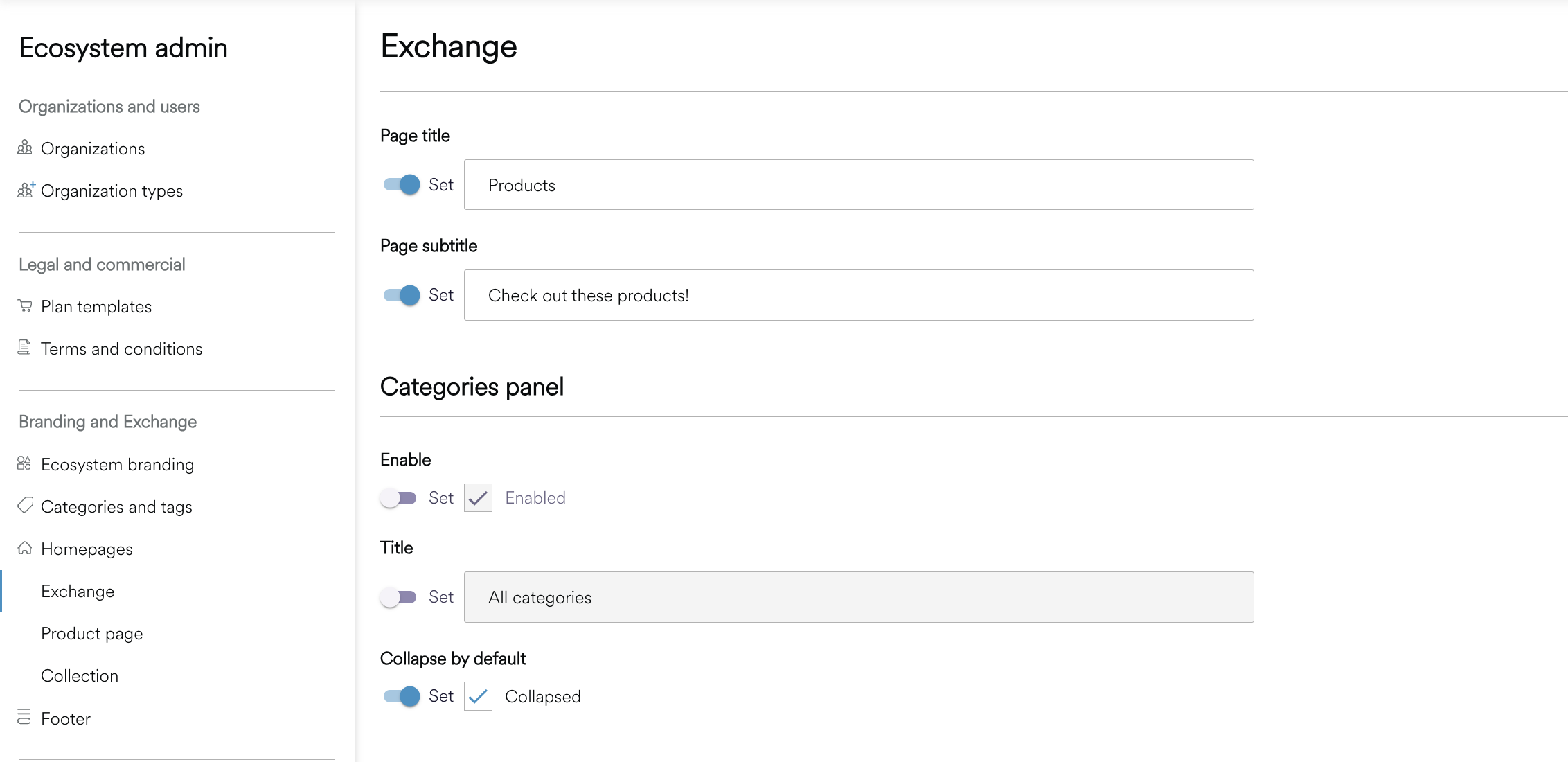
The Exchange
The Exchange is your main marketplace page where users browse and discover products.
|
Setting |
What it does |
|
Page header |
Customize the welcome message users see at the top of the marketplace. |
|
Page title |
The main heading (e.g., "Browse data products") |
|
Subtitle |
Supporting text below the title |
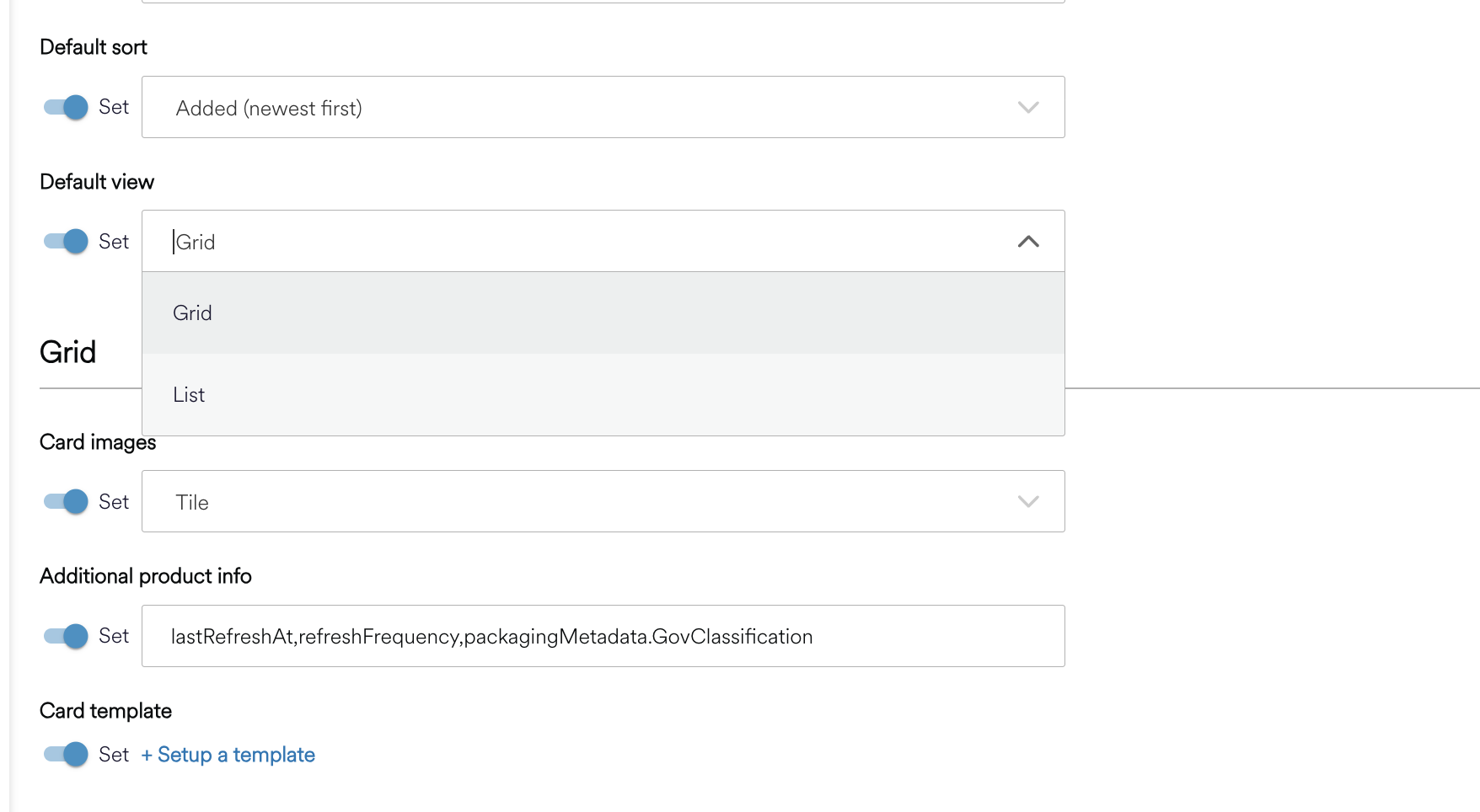
Display Controls
Configure the default viewing experience.
|
Setting |
What it does |
Options |
|
Default sort |
How products are sorted initially |
Name (A-Z), Name (Z-A), Added (newest first), Added (oldest first) |
|
Default view |
Grid or list layout |
Grid, List |
|
Filters |
Which filters appear in the bar |
See Configuring Filters |
a. Grid View
Customize how products appear in the grid/card view.
|
Setting |
What it does |
Options |
|
Image style |
How product images are displayed |
Tile (large rectangular), Icon (small square), No image |
|
Additional info |
Extra fields shown on each card |
See Showing Extra Information |
b. List View
Customize how products appear in the list view.
|
Setting |
What it does |
|
Show icons |
Display product icons in the list |
|
Additional info |
Extra fields shown for each product |
Categories Panel
Control the sidebar that shows product categories and tags.
|
Setting |
What it does |
|
Show categories panel |
Toggle the sidebar on/off |
|
Panel title |
Header text for the panel (e.g., "All categories") |
|
Collapsed by default |
Start with categories collapsed |
For more information on configuring the Exchange and Product cards using templates, see here for the dedicated section - The Exchange
Featured Products
If you have a homepage with featured products, these settings control their appearance.
|
Setting |
What it does |
Options |
|
Image style |
How images display on homepage cards |
Tile, Icon, No image |
|
Additional info |
Extra fields on homepage product cards |
See below |
For more information on configuring your Homepage, see here Homepages
Product Pages
Control how individual product detail pages appear. As explained below, value templates can also be used in the Product Page sidebar for displaying metadata. When a metadata field has a registered template, that template is used instead of the default rendering for that field's display type.
Metadata Display
For each metadata field, you can configure:
|
Setting |
What it does |
|
Display type |
How the value is rendered (see below for options of information to include) |
|
Label |
The field name shown to users |
|
Icon |
An icon displayed next to the field |
Details to Display
There are numerous aspects you can include to the product page.
|
Type |
Best for |
Example |
|
Text |
General information |
Financial data for Q4 2025 |
|
Copyable text |
IDs or references |
Click to copy product ID |
|
|
Contact addresses |
|
|
Date |
Timestamps |
January 15, 2026 |
|
Tags |
Multiple values |
Open, Verified, Premium |
Asset View
|
Setting |
What it does |
Options |
|
Default asset view |
How product assets are displayed |
Grid, List |
Related Products
Configure the Related Products section shown on product pages.
|
Setting |
What it does |
|
Image style |
Tile, Icon, or No image |
|
Additional info |
Extra fields on related product cards |
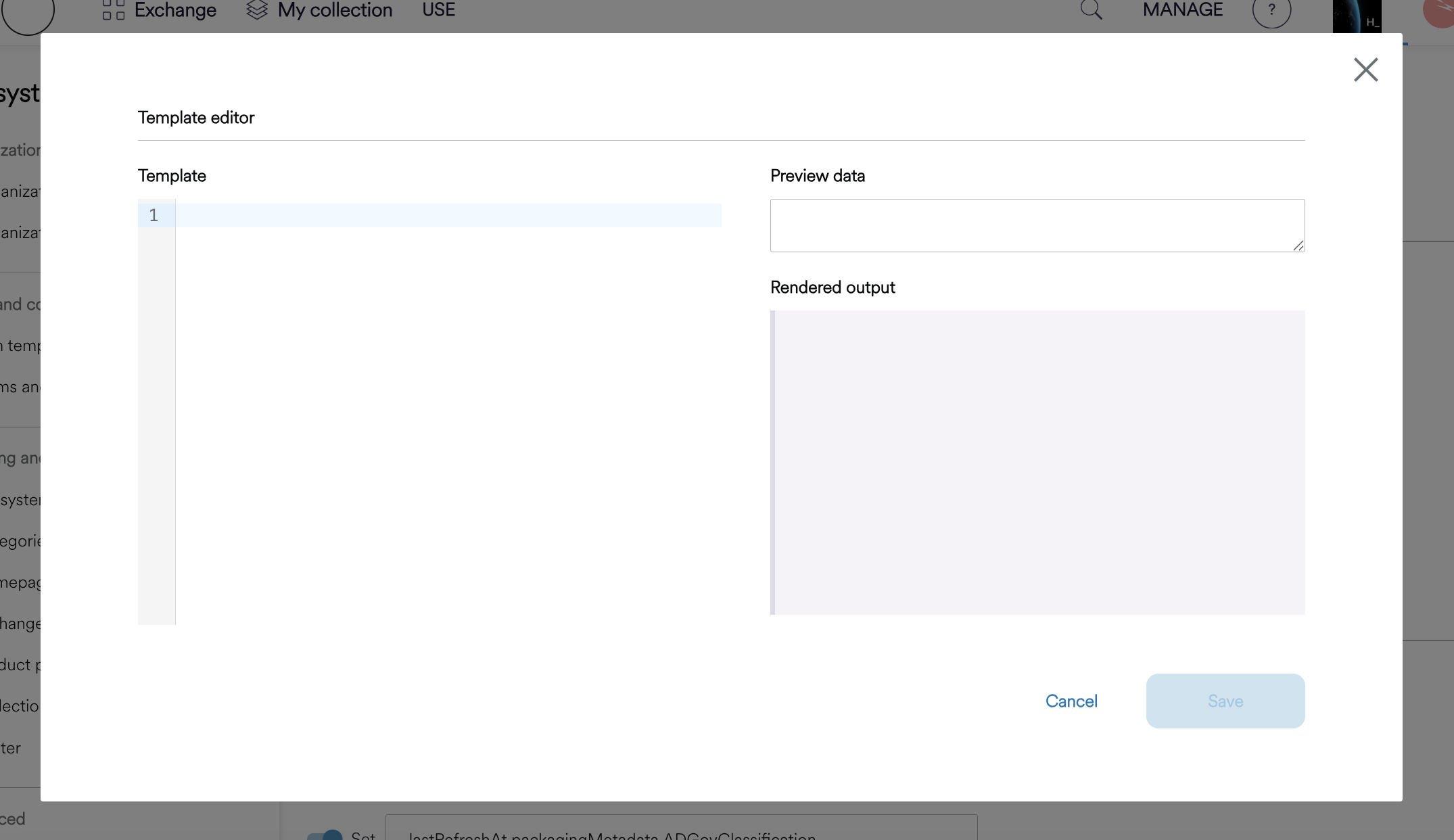
Advanced: Template Editor
There is an option for more advanced users to include a template input to further customize the page presentation. Value templates let you customize how individual metadata fields are rendered using Liquid templates. This is useful when you need more control than the built-in display types provide.
To Register a Value Template:
-
Navigate to the Product Page on Eco Admin settings under ‘Product Presentation templates’
-
Click + Register a new template
-
Enter the Path (metadata field identifier) and click Next
-
Write your Liquid template and preview the output
-
Click Save
Note: Currently, only Liquid templates are supported. Liquid is a simple templating language that lets you insert dynamic values and add conditional logic.
Understanding the Path Field:
The Path is the metadata field's key/identifier - not a file path or URL. It tells the system which metadata field should use this template.
Path Examples - What it Targets
-
The data classification field
: XXClassification -
The data owner field :
dataOwner -
The refresh frequency field:
refreshFrequency
Your template receives the field's value in the value variable and the metadata field's value (string)
To find your metadata field keys, see Finding Your Packaging Metadata Keys.
Example Templates
Color-coded classification badge:
{% if value == 'Confidential' %}
  <span style="color: #d32f2f; font-weight: bold;">{{ value }}</span>
{% elsif value == 'Internal' %}
  <span style="color: #f57c00;">{{ value }}</span>
{% else %}
  <span style="color: #388e3c;">{{ value }}</span>
{% endif %}
Clickable email link:
<a href="mailto:{{ value }}">{{ value }}</a>
Value with icon:
<span>📅 {{ value }}</span>
My Collection
The Collection page shows users the products they are subscribed to.
Page Header
|
Setting |
What it does |
|
Page title |
The heading (e.g., My Collection) |
|
Subtitle |
Supporting text |
Controls
|
Setting |
What it does |
|
Default sort |
Initial sort order |
|
Filters |
Which filters to show |
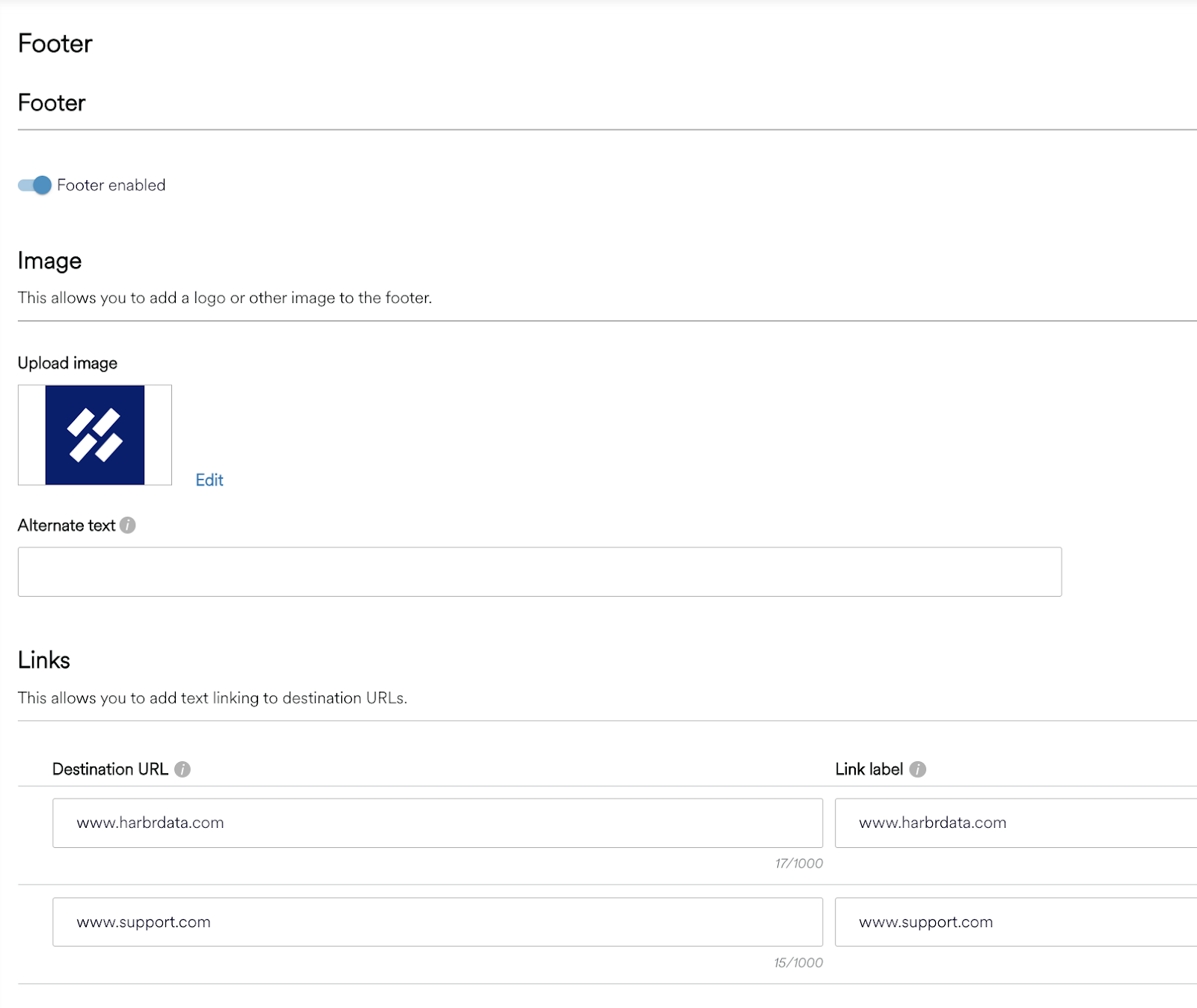
Platform Footer
A configurable Footer section is available for Ecosystem Administrators to enable and configure the Footer component that is shown at the bottom of the platform for all pages. The footer can be enabled or disabled at any time and the setting applies to all users in the platform.
We recommend previewing the footer to ensure that the content is visible and usable. If configured, the footer will be displayed at the bottom of every page across the platform.
|
Setting |
What it does |
|
Enable footer |
Show or hide the footer |
|
Fixed position |
Keep footer visible at bottom of screen |
The footer has three sections arranged left to right:
Logo/Image (Left)
|
Setting |
What it does |
|
Image |
Upload or provide URL |
|
Alt text |
Accessibility description |
Links (Center)
|
Setting |
Limits |
|
Link label |
Max 30 characters |
|
Link URL |
Full URL including https:// |
|
Number of links |
Maximum 5 |
Text (Right)
|
Setting |
Limits |
|
Content |
Max 200 characters |
You can use {{YYYY}} to automatically insert the current year.