For an overview of UI customizations, please see UI Customizations. Please note that you must have the appropriate Ecosystem Administrator Role in order to configure settings.
Sort Options
-
Name (A–Z)
-
Name (Z–A)
-
Added (newest first)
-
Added (oldest first)
Built-in Filters
-
Asset Types
-
Table
-
View
-
File
-
Xlsx
-
Pdf
-
Visualization
-
-
Publisher
-
Subscription status
-
Categories/Tags
Custom Filters (Packaging Metadata)
To add a custom filter:
-
Find the key of your packaging metadata field
-
Enter
packagingMetadata.<key>in Filters -
The filter will show all values that exist across products
Finding Metadata Keys
Packaging metadata keys are defined in Ecosystem Settings under the Product Packaging Metadata Schema. Example:
Field: Data Classification
Key: InternalClassification
Options: Open, Confidential, Sensitive, Secret
Tips & Best Practices
-
Start simple and customize gradually
-
Test filters to ensure products have values
-
Keep card info minimal and use clear labels
-
Preview changes before rolling out
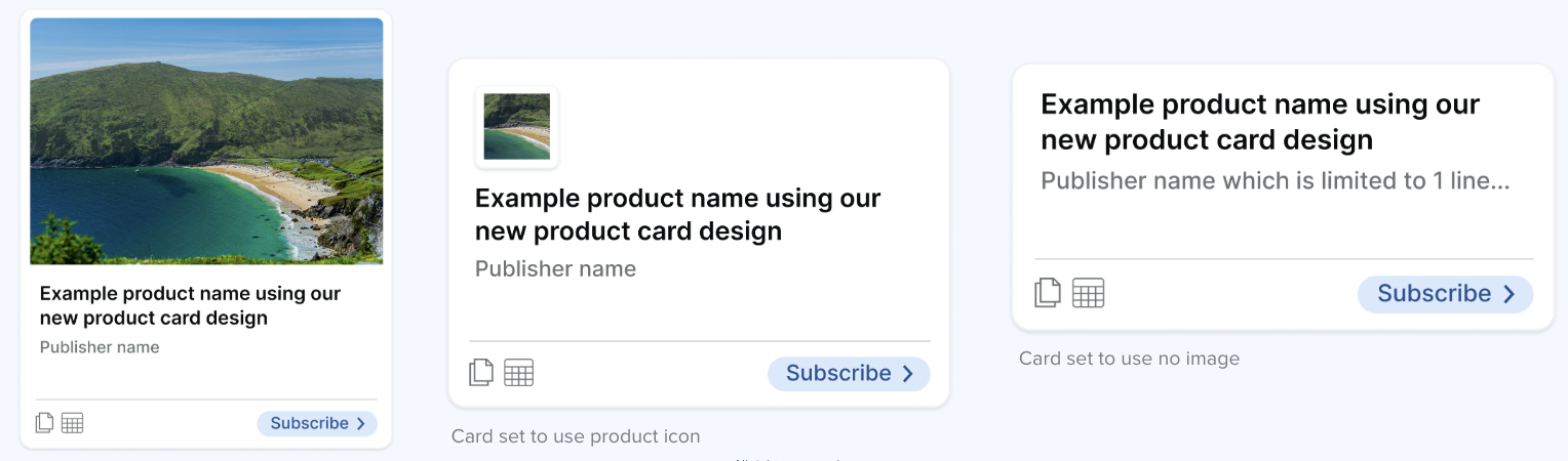
Product Card Design
New Layout
The new product card design introduces a refreshed layout with the following elements included by default:
-
Rectangular tile image with a 10:7 aspect ratio
-
New placeholder tile image when no custom image is set for a product
-
Product name, displayed in full
-
Publishing organization name
-
Asset type icons, shown on the bottom-left of the card
-
CTA (Subscribe) or subscription status, shown on the bottom-right of the card
-
Summary text hover state, which is only shown if summary text exists for the product
Subscription CTAs and Statuses
The bottom-right area of the product card can display one of the following:
-
Subscribe button
-
Links to the Plans section of the product page
-
-
Subscribed status
-
Displayed when there is an active subscription
-
-
Subscribed with attention badge
-
Displayed when user action is required
-
-
Request pending status
-
Displayed when an approval request has been sent (if approvals are enabled)
-
Flexibility with Images
For customers who prefer not to use tile images, the new product card design supports additional image options via a new (early access) UI customization capability.
Using this capability, all product cards can be configured to use:
-
Product icon, or
-
No tile image or icon
This allows ecosystems to adopt a more minimal or text-focused presentation if desired.
Where do Product Cards appear?
The new product card design is used in the following locations:
-
On the Exchange grid view
-
On the product page, in the Related products section
-
On Homepages, in sections that feature products
Manage Products View
There are updates in Manage Products to support the new product card design:
-
A preview of the new product card is displayed using the selected image
-
A crop control set to a 10:7 ratio is offered when uploading an image
-
The image can be rotated in the editor if desired
When this feature is enabled, a 10:7 crop will automatically be applied to any existing custom tile images in products.
Extra Information on Cards
Product cards can display additional metadata fields beyond the standard name and description. To add extra information to cards:
-
Find the key of your packaging metadata field (see above)
Example:XXClassification -
Enter the key in the "Additional product info" field (just the key, not the full path)
Example:XXClassification(notpackagingMetadata.XXClassification)
--> Note: For multiple fields, separate them with commas -
As a result, the field label and value will display on each product card that has data for that field.
To use and register a template for product cards, please contact Harbr Support to configure.
Troubleshooting
-
Filters show no options: products may lack values or key may be incorrect
-
Additional info not showing: verify key spelling and product values
-
Changes not visible: refresh page, clear cache, confirm save